Rebrand: Sharing Excess
Sharing Excess is Philadelphia-based nonprofit dedicated to eliminating food waste and food insecurity. I worked as a graphic designer at Sharing Excess in 2020, which led me to rebrand the organization for my senior capstone.
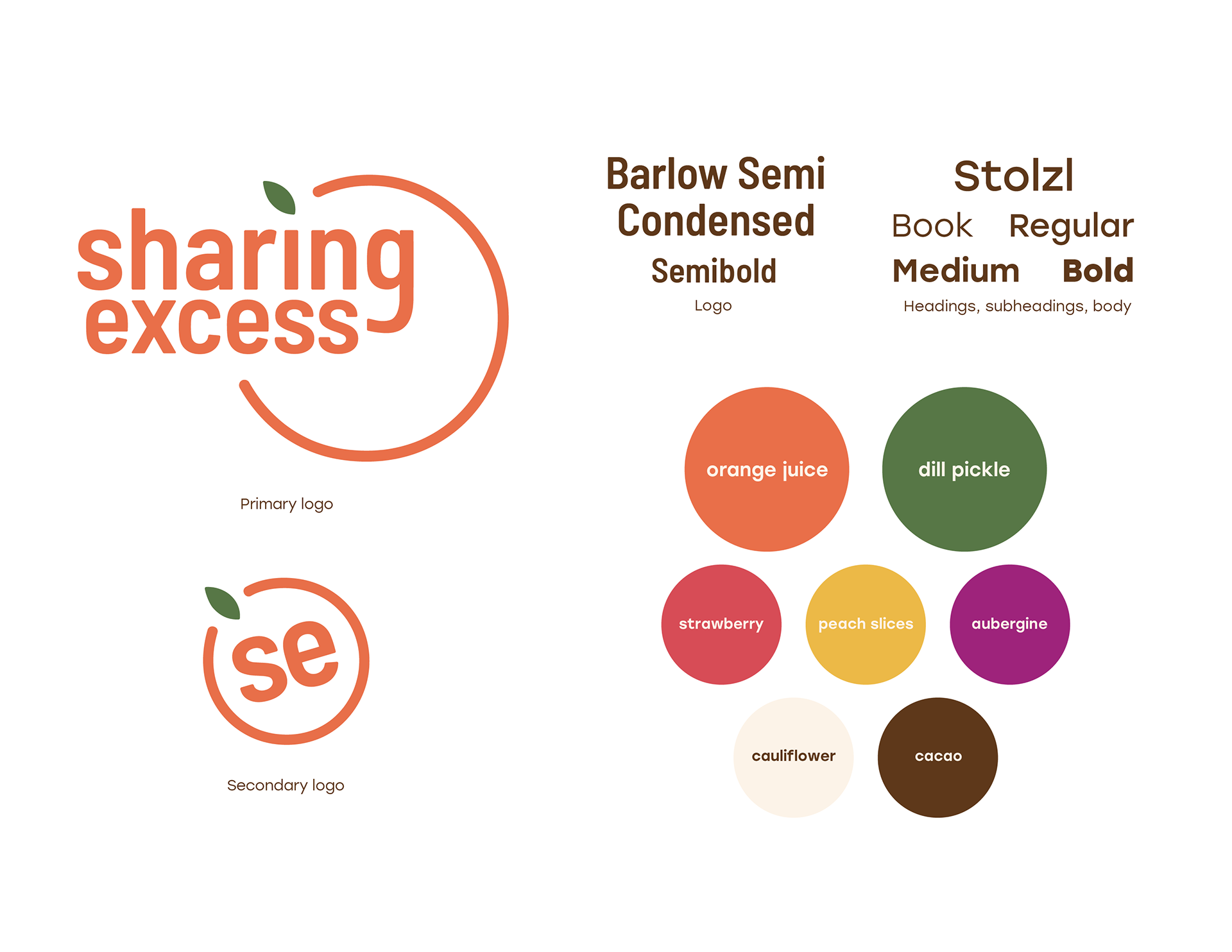
The problem: Sharing Excess's current logo does not relate to what the organization does, the brand lacks consistent and recognizable iconography, and its color palette should be more vibrant and diverse.
Approach: All branding pieces should call back to what drives Sharing Excess: food. This begins with its fundamental elements, which includes a logo and color palette.
The imagery combines bold, vibrant food photography and quirky, fun illustrations to make the organization's visual identity friendlier and easily identifiable.
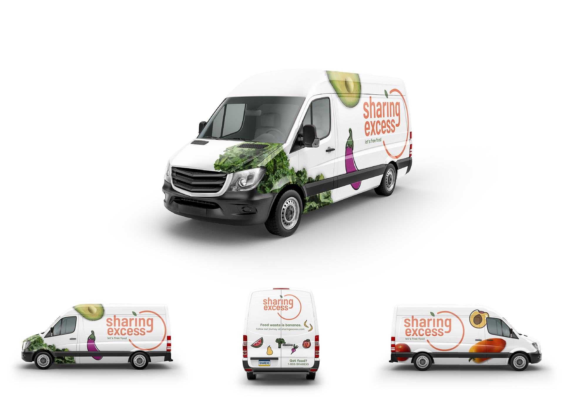
Food rescue: One of the main methods in which Sharing Excess rescues and redistributes food surplus is via automobile. The rescue van combines the brand's photographic and illustrative food iconography to establish a recognizable brand to bystanders as they travel around Philadelphia.
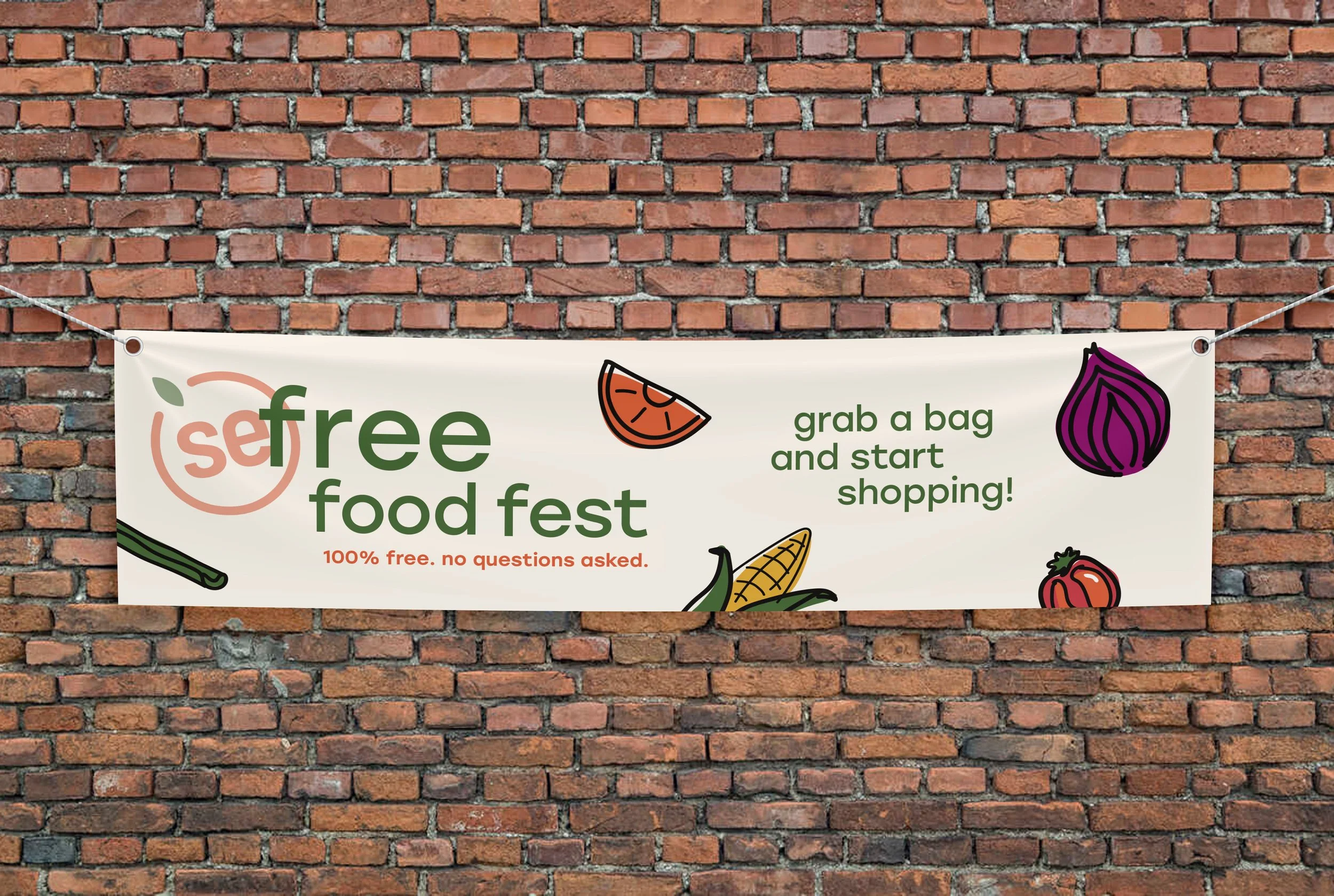
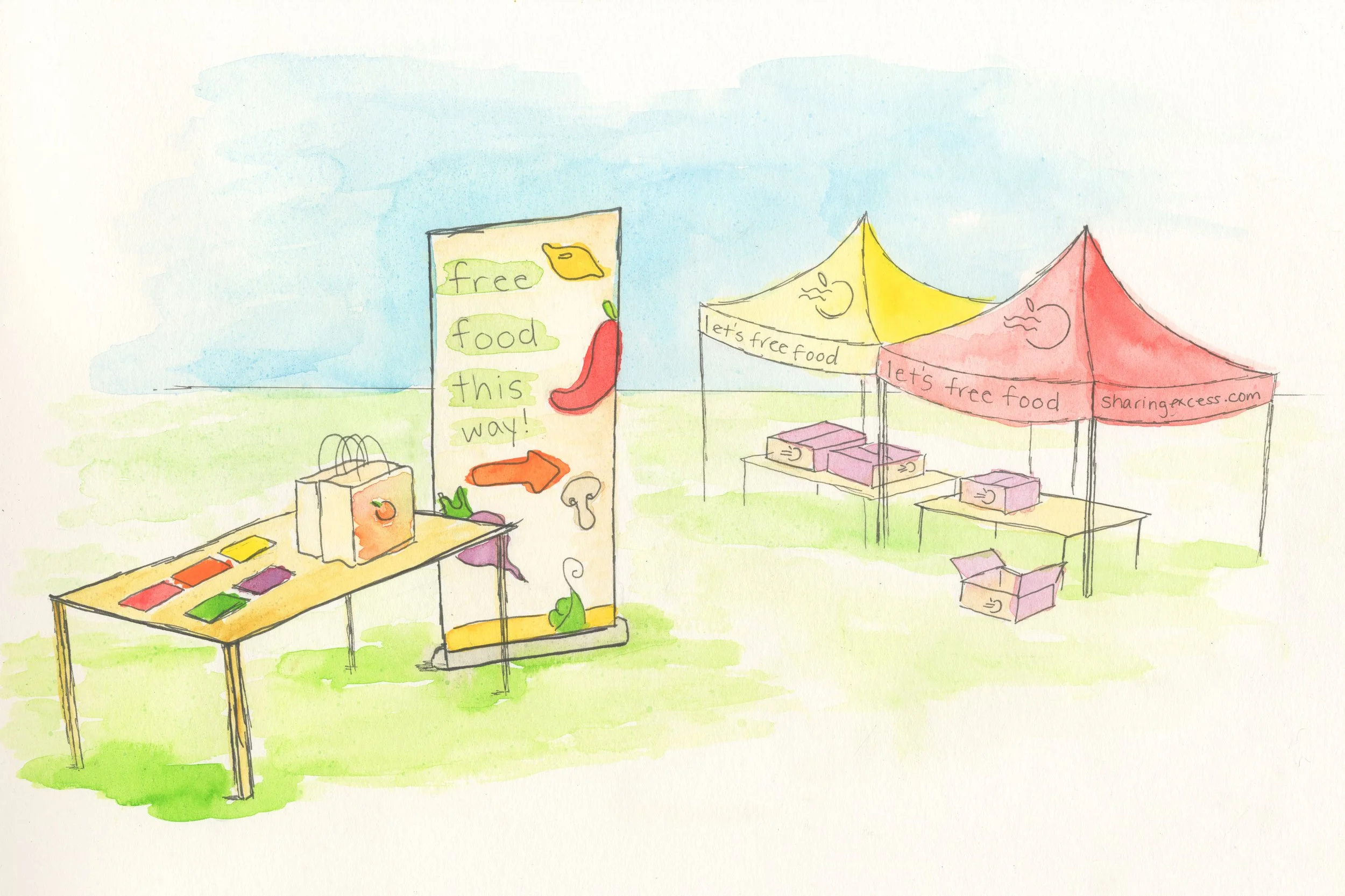
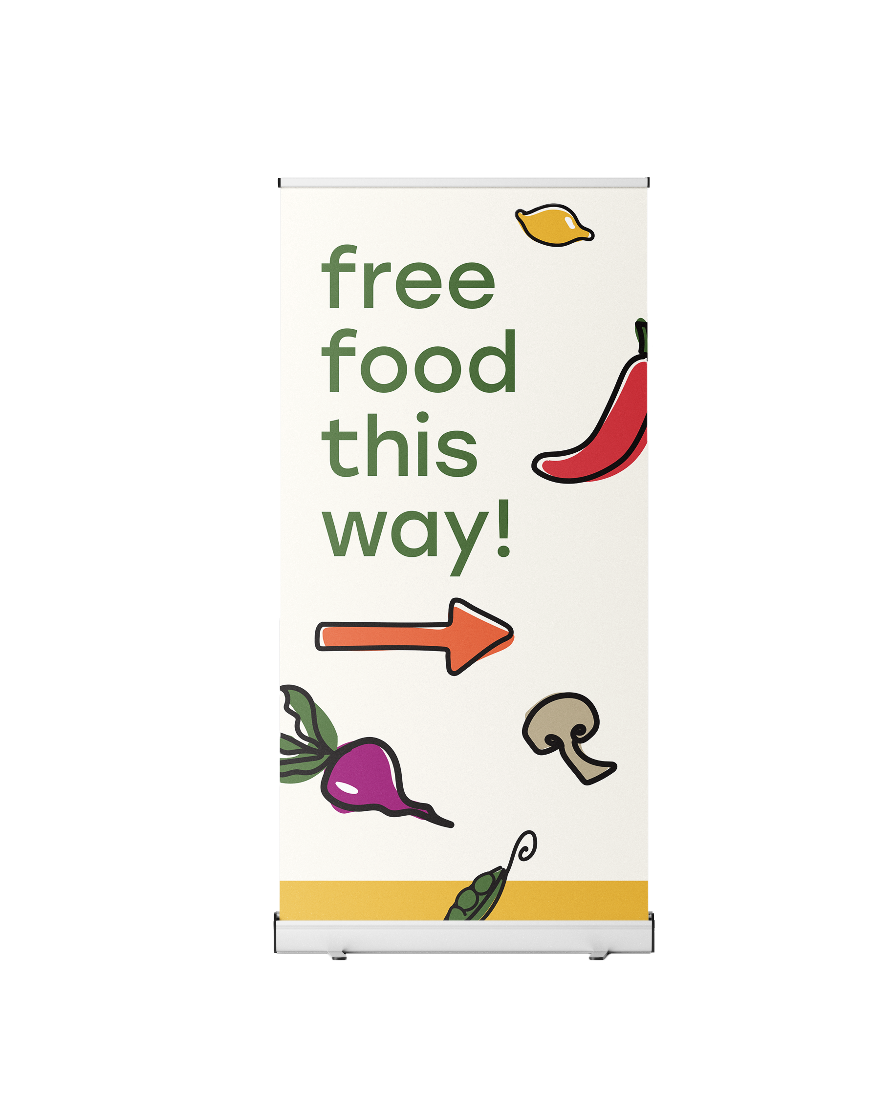
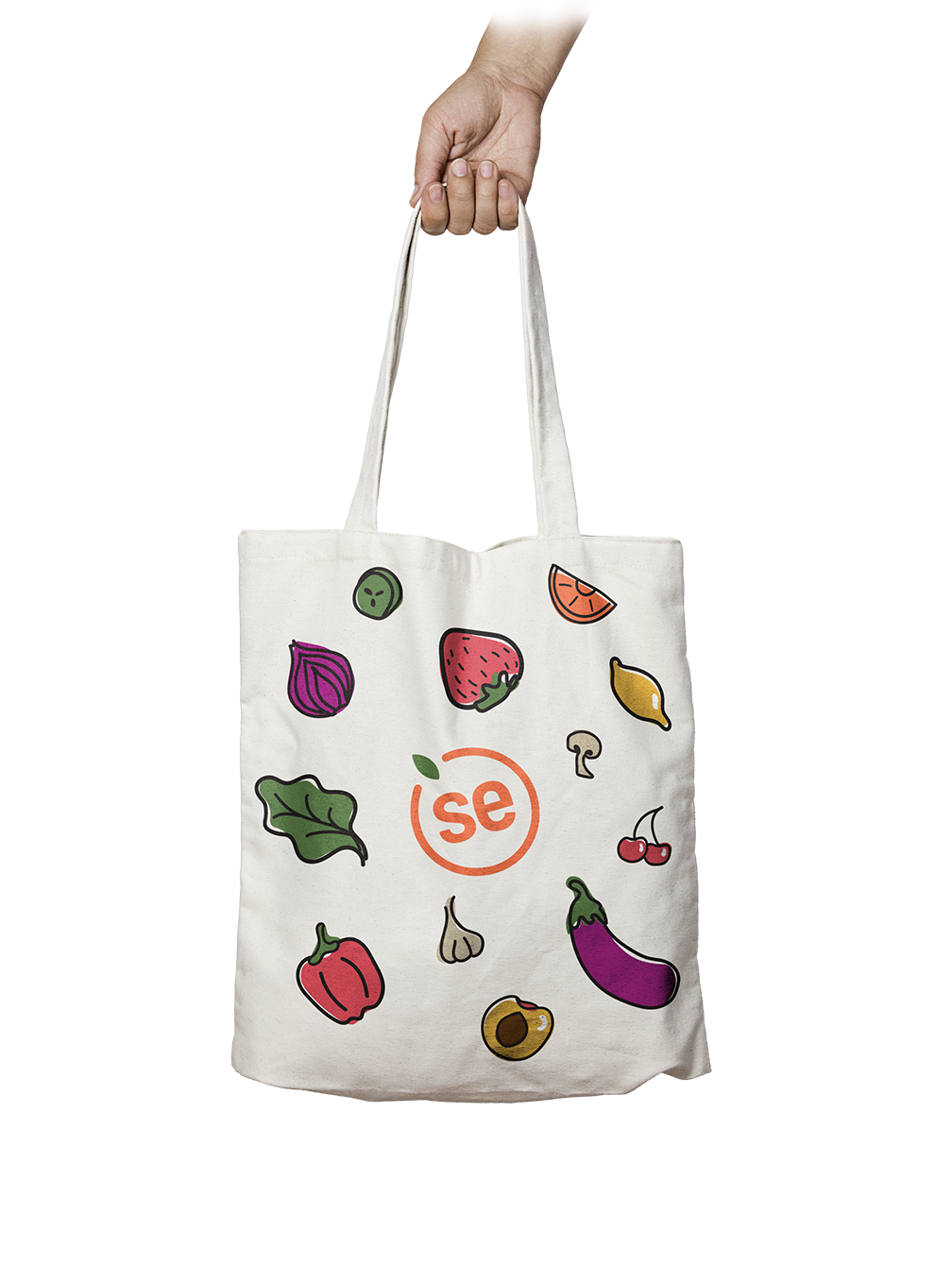
Food fests: Another method in which Sharing Excess distributes food is via pop up food festivals throughout Philadelphia. Wayfinding and structural pieces utilize the brand's range of colors and iconography and are designed to be reusable, not exclusive to a singular event. This includes banners, tents, tote bags and boxes.
Food fests: Another method in which Sharing Excess distributes food is via pop up food festivals throughout Philadelphia. Wayfinding and structural pieces utilize the brand's range of colors and iconography and are designed to be reusable, not exclusive to a singular event. This includes banners, tents, tote bags and boxes.
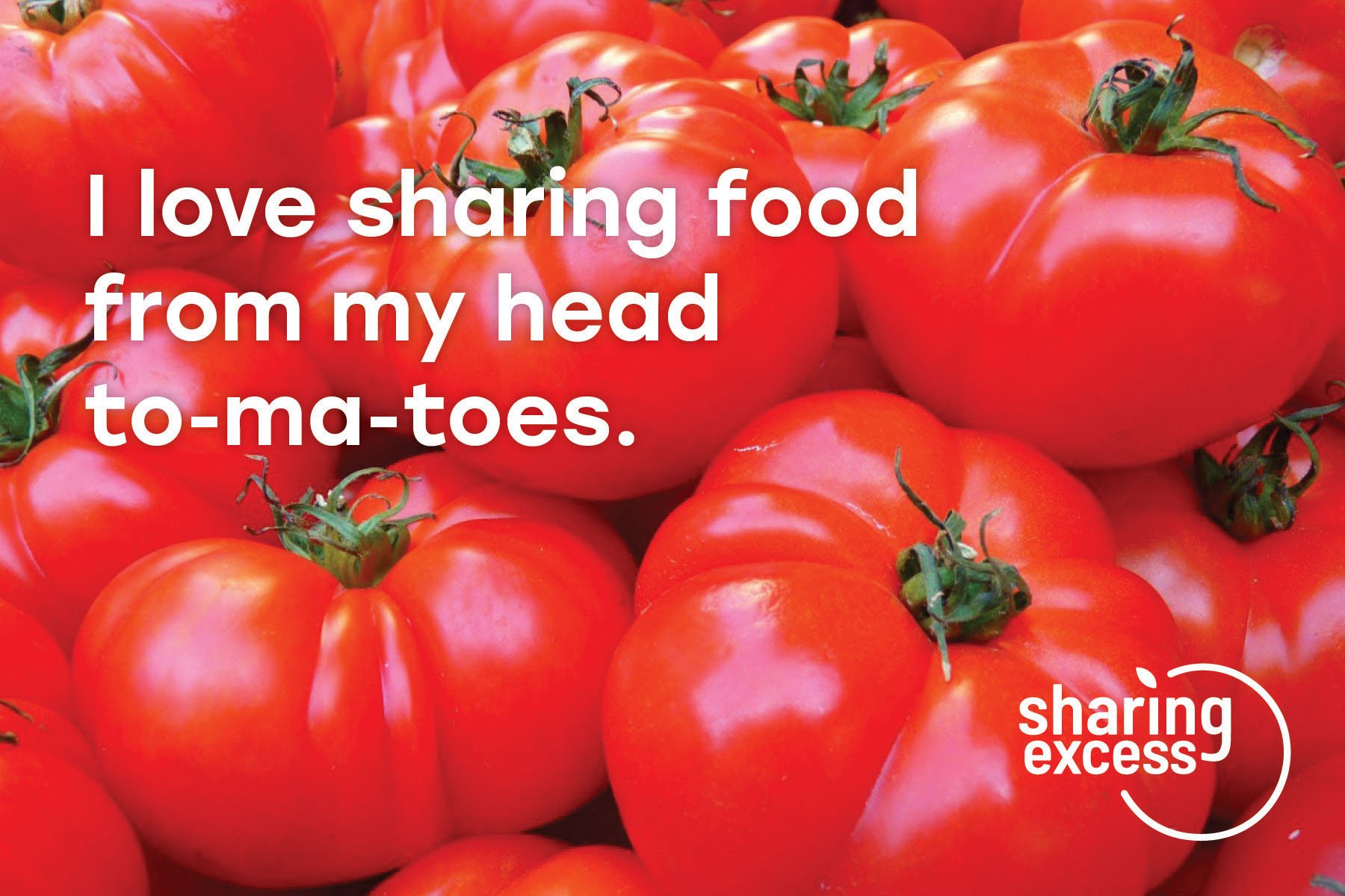

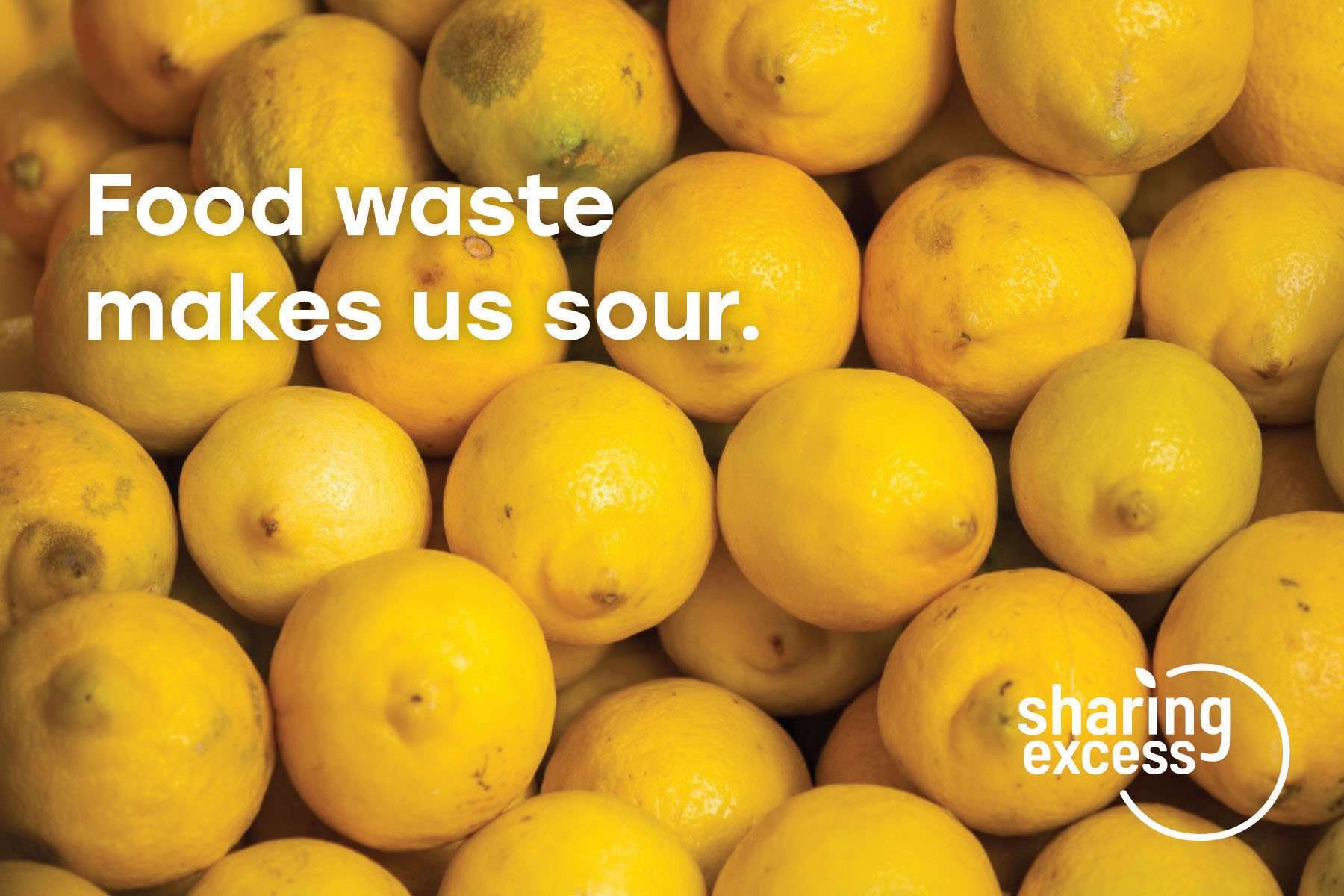


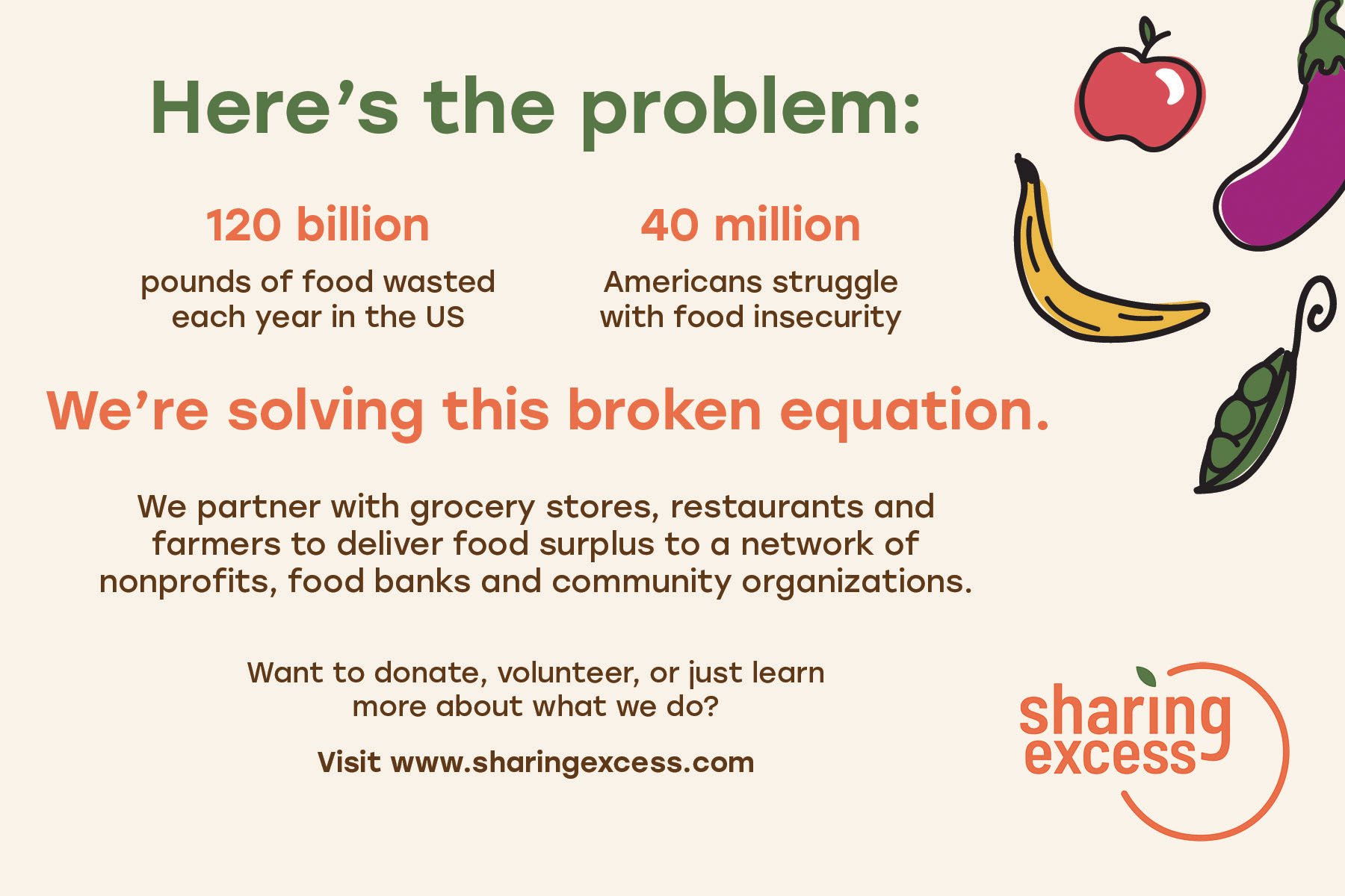
A series of handouts designed to be distributed at events that utilize bold, vibrant photography and quirky food-based puns. While it remains lighthearted, it educates on the statistics regarding food waste in the United States, what Sharing Excess does to fight it, and encourages the consumer to learn more.
Digital outreach: The website landing page briefly provides a background of Sharing Excess, the statistics on food waste that drive the organization, the impact Sharing Excess has already made, and means of getting involved.
Outcomes: Sharing Excess's brand identity is now distinct, bold and friendly. It has a substantial library of imagery and iconography, but there is room for it to grow even more. The new system is much more cohesive than the previous and will foster growth within Philadelphia and help it expand nationally.
This project has no affiliation with Sharing Excess and is for personal and educational use.
